Starting point
A personal sketch combining elements of Thomas’s name and “III” in a tornado-like symbol.

Case study · Author and personal brand
The concept already had meaning. FocusPoint Design’s role was to give it form: translating an author’s personal sketch into a balanced, usable identity mark.
What changed
A personal sketch combining elements of Thomas’s name and “III” in a tornado-like symbol.
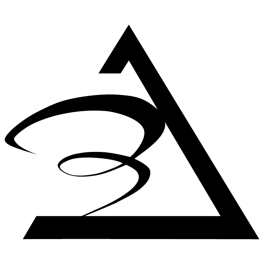
A resolved, scalable vector mark that preserves the original concept and gives it a practical structure for an author brand.
01 · Context & challenge
As Thomas J. Gebhardt III began his author career with his first book, he wanted a distinctive mark to represent him. His rough sketch combined elements of his name and the significance of “III” in a dynamic, tornado-like symbol. The idea and its personal meaning were already his; the challenge was to resolve the form for professional use.
02 · Insight
The strongest part of the concept was its connection to Thomas. Understanding what he wanted to communicate established the direction: preserve the personal references and tornado-like character, then refine the structure around them. The identity needed the clarity to function as a symbol while remaining faithful to his original idea.
03 · Design decisions
FocusPoint Design refined the geometry, simplified the form, and adjusted spacing, alignment, and proportion. Fibonacci-based proportions helped establish visual balance. Each adjustment served the same purpose: retain the character of the sketch while making the mark more intentional, recognizable at small sizes, and practical to reproduce. Restraint meant changing only what helped the idea work.
04 · Identity delivered
The finished identity retains Thomas’s personal references and the movement of his original concept. A more balanced visual structure gives those elements a coherent, symbolic form, with the precision of vector artwork for use across print and digital applications.
05 · Outcome
The deliverable was a resolved, scalable identity mark prepared for books, websites, social profiles, and promotional materials. It translates Thomas’s own concept into a usable visual asset, demonstrating how careful refinement can preserve what makes an idea meaningful.
Credits
Client: Thomas J. Gebhardt III · Logo refinement, vector development, creative direction, and design: Michael Tobita / FocusPoint Design · Original concept: provided by the client