Starting point
A need for one recognizable identity across products, labels, packaging, and varied production conditions.

Case study · Products and packaging
A new logo family for a Japan-based company, built to hold up on products, packaging, labels, light backgrounds, and dark backgrounds.
What changed
A need for one recognizable identity across products, labels, packaging, and varied production conditions.
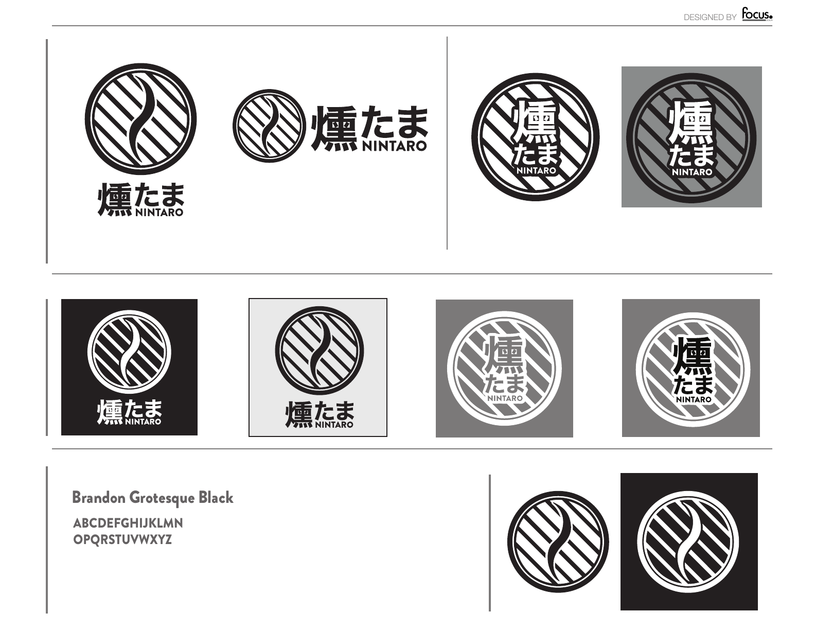
A seven-part logo family covering primary, secondary, horizontal, icon, positive, reversed, and single-color use.
01 · Challenge
Kuntama Nintaro needed a recognizable mark that could work on products, labels, and packaging in different sizes, layouts, colors, and production methods.
02 · Discovery & insight
A client discovery call, visual reference review, and competitive scan showed which shapes and styles appeared throughout the category. That made room for a direction Kuntama Nintaro could own.
03 · Design decisions
Several original concepts tested different readings of the company. After one direction was selected, the typography, spacing, balance, and small-size legibility were refined for both light and dark backgrounds.
04 · Identity delivered
The final files include primary, secondary, horizontal, icon, positive, reversed, and single-color versions for physical and digital use.
Credits
Client: Kuntama Nintaro · Discovery & insight, research, competitive analysis, logo concept development, refinement, creative direction, and design: Michael Tobita / FocusPoint Design