Starting point
A client-supplied concept with uneven construction and one practical layout.
Case study · Brand identity
A client sketch rebuilt as clean vector artwork, then expanded into primary, secondary, one-color, and reversed marks.
What changed
A client-supplied concept with uneven construction and one practical layout.
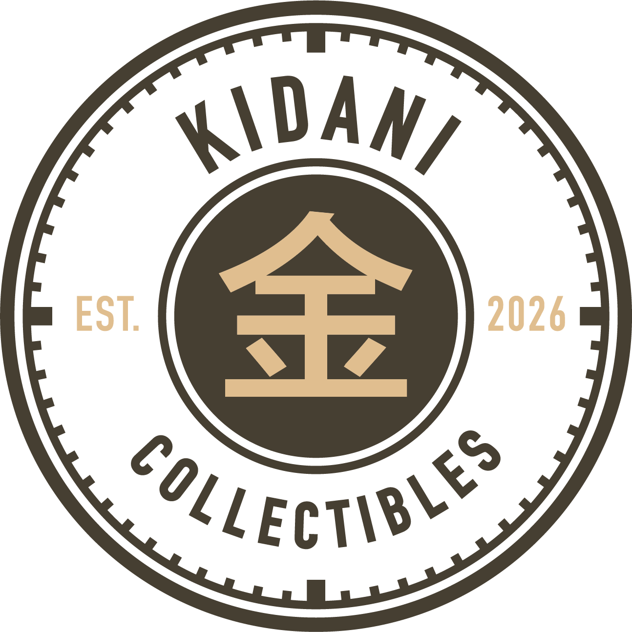
Clean vector artwork, primary and secondary marks, one-color and reversed versions, and a usage guide.
01 · Challenge
The client supplied the central logo idea. Uneven construction and a single layout made it difficult to reproduce at different sizes and with limited colors.
02 · Design decisions
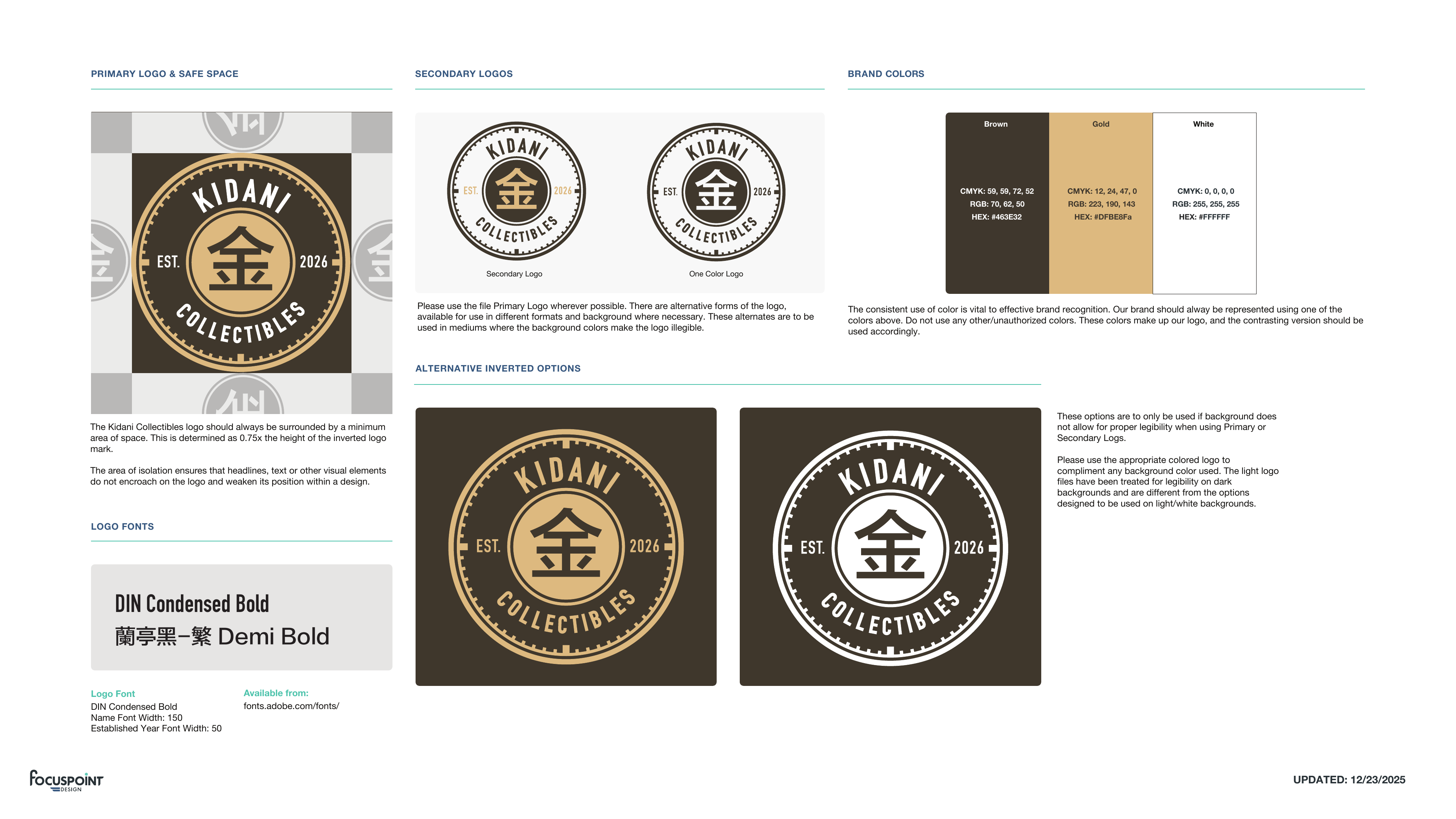
FocusPoint Design redrew the artwork as vectors, tightened the composition, and balanced the spacing without changing the direction the client wanted.
03 · Identity delivered
The final files include primary and secondary marks, one-color treatments, a reversed version, and a short guide showing which version to use.

Credits
Client: Kidani Collectibles · Logo refinement, system development, creative direction, and design: Michael Tobita / FocusPoint Design · Original concept: provided by the client