Starting point
One stacked mark designed mainly for light backgrounds.

Case study · Real estate
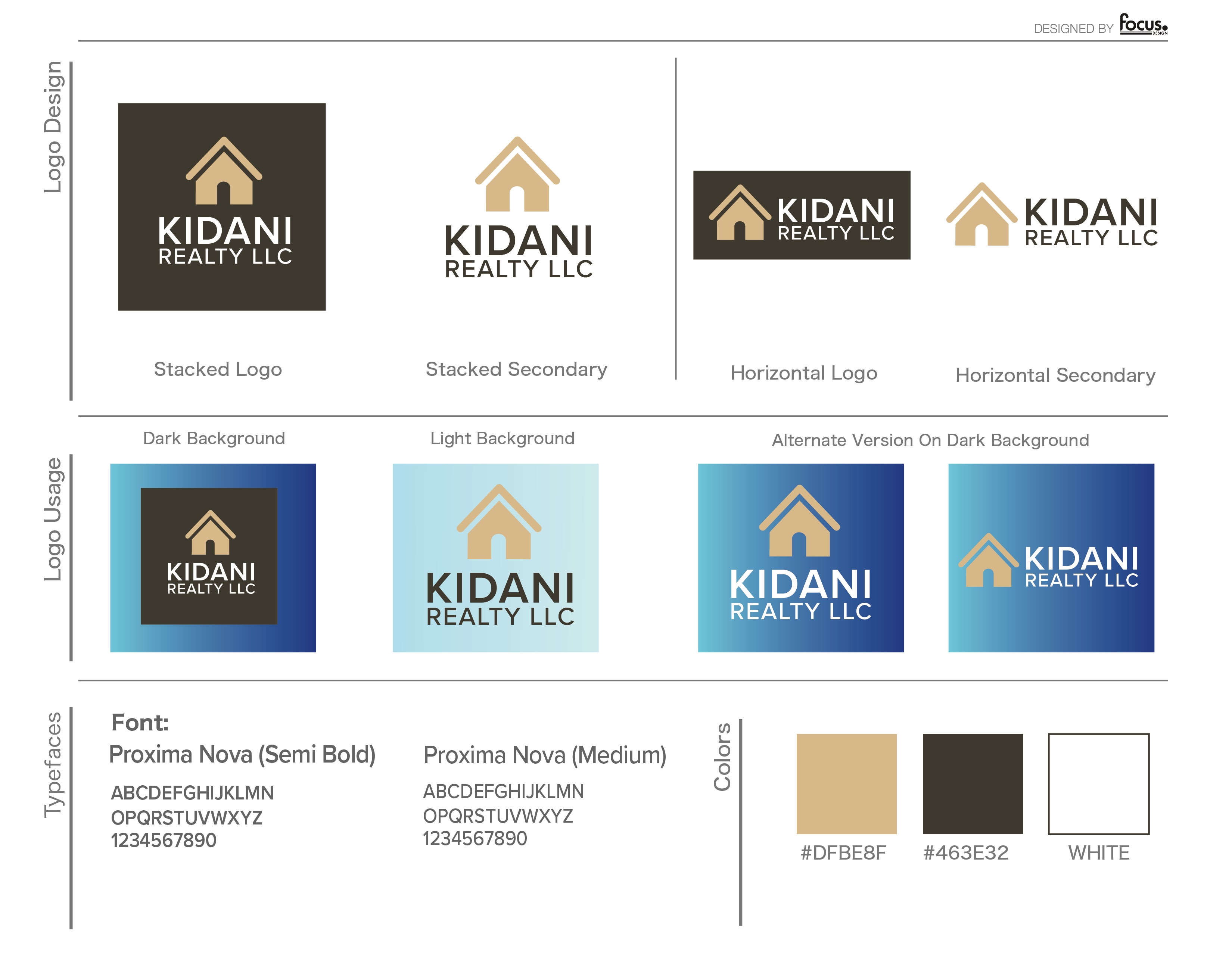
An existing stacked logo cleaned up and expanded for vertical, horizontal, light, dark, full-color, and one-color use.

What changed
One stacked mark designed mainly for light backgrounds.
Stacked and horizontal layouts with full-color, reversed, and simplified options.
01 · Challenge
The supplied mark worked mainly on a light background in a vertical space. It needed cleaner construction and options for websites, signs, print, social posts, and promotional pieces.
02 · Design decisions
FocusPoint Design corrected the spacing, alignment, and proportions, then built alternate layouts for wide spaces and dark backgrounds.

03 · Identity delivered
The final family pairs stacked and horizontal layouts with full-color, reversed, and simplified options. The team no longer has to force one logo into every space.
04 · Result
Kidani Realty received a coordinated set of logo files rather than one standalone mark. Business and performance results have not yet been documented.
Credits
Client: Kidani Realty · Logo refinement, system development, creative direction, and design: Michael Tobita / FocusPoint Design · Original concept: provided by the client